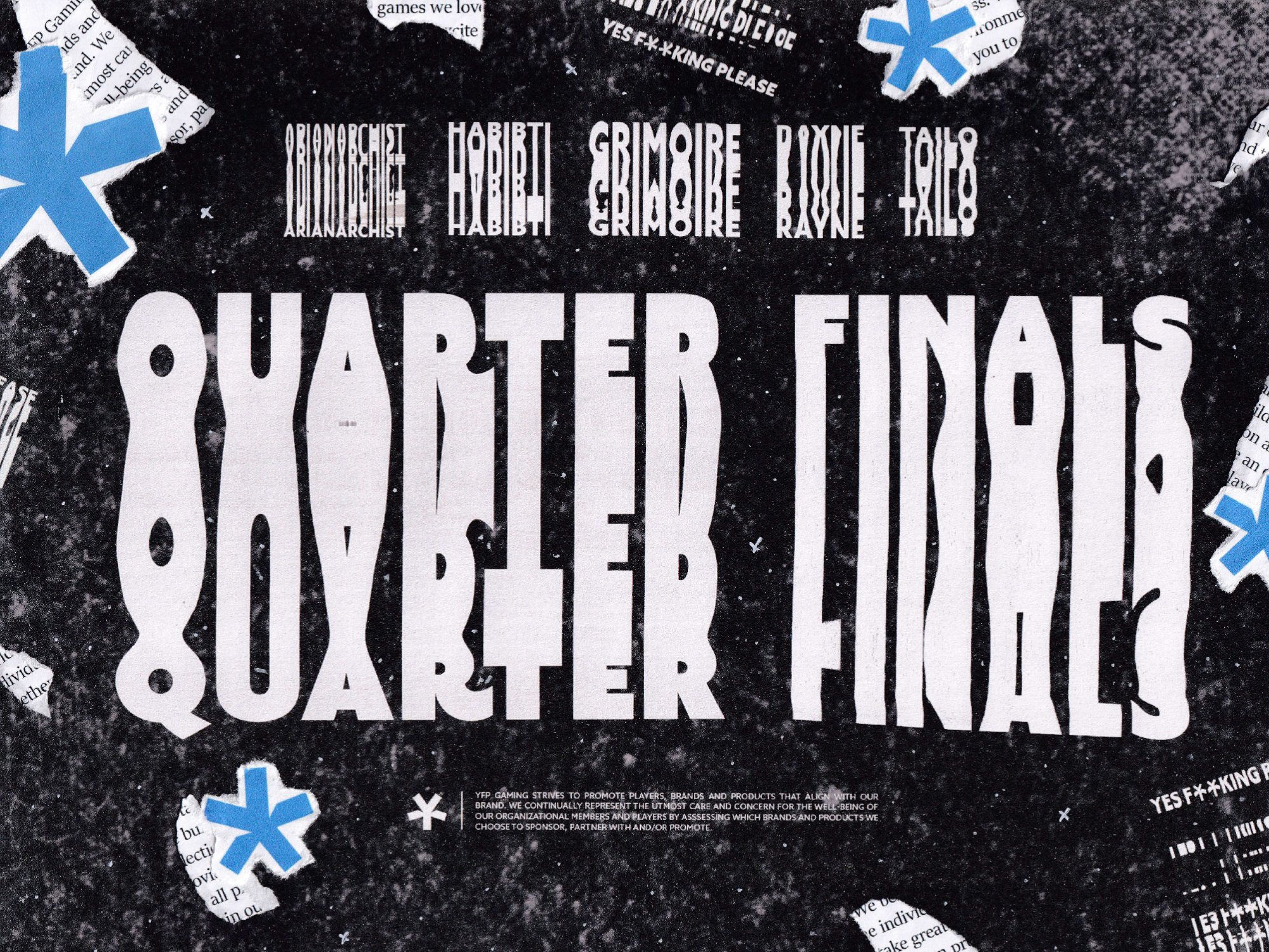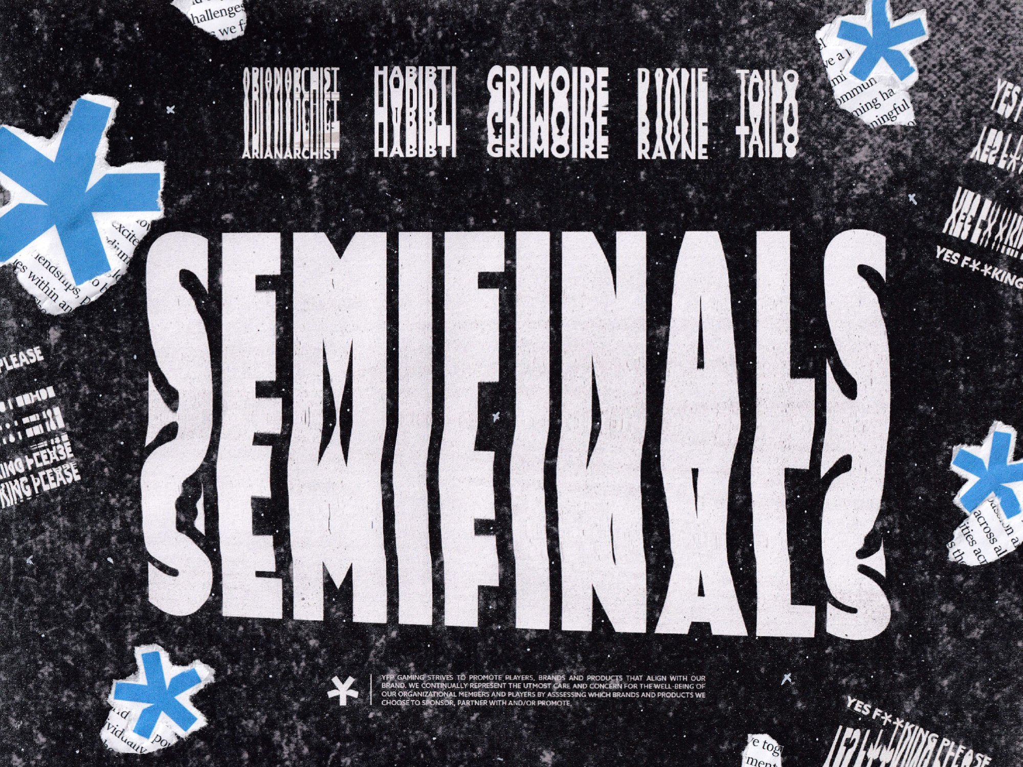
With the style of YFP’s GC team being heavily rooted in the idea of “remix” and being done by hand, I decided why fake it? I printed all of the materials and did it by hand. To create the exaggerated text, I printed the original text and played around with my Cannon Scanner until I got semi-legible text before printing that on a textured background. The rest was just printing everything and ripping, taping, and a white acrylic pen to get the white dots and some added doodles for depth. The ripped text is YFP’s mission statement.
Role
Art Director / Lead Designer


